I found Figma a couple years ago and have integrated it within the discover and development phases quite well. The main use was mockups and simple prototypes mainly because that’s all we had capacity for at the time. But I knew that Figma could do so much more, especially from a collaboration and communication standpoint.
I decided to level up my skills by taking an online course. Enter Udemy’s Figma UX/UI Design Essentials taught by Dan Scott. It’s a self-paced course of videos and tutorials along with practice assignments that are submitted on the course group chat. It took about 20 hours to complete and went over not just Figma basics but all the tools and tricks required to use Figma efficiently and take your Product Design skills to the next level.

Here are my key takeaways from the course:
1. Components and Variables are key
The worst thing I can imagine, is opening a Figma project and being overwhelmed by countless number of frames and duplicate assets. A design could be the pretty and user friendly but be terrible to update when that’s the case.
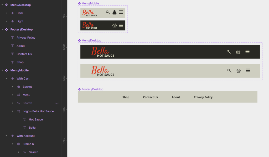
Figma groups elements with same name start.

The brilliant way to avoid this and future headaches when your design ultimately will need to change based on feed back is by setting up all your UI elements as Components. It can’t be over stated how useful it is to have things linked.
You can keep components in separate pages, projects and even libraries if you’re working within a team.
And it gets better, you can create variables based on any attribute you want. Or if variables are too much to wrap your head around, Figma has the ability to group elements if you use “/” within the names.
I learned that getting in the habit of naming elements as soon as they are created also helps me group them in a logical manor which makes the project more organized. Also, writing out the naming convention helps everyone stick to it! Both are essential when you’re working on a long term project and will likely need to collaborate with others or at some point had the project over.
2. Take the time to setup your basics

At a certain point in the course when the Lo-Fi Prototype was done, I started to feel impatient wanting to skip forward. We were going over the esthetic elements of design and I found myself not engaging with the topic. The video was all about setting up styles and a colour palate. I know I’m not the only one that’s ever wanted to just jump in and start creating! I’ve always just figured it out as I went along. My approach always included putting things together to see what looked good.
At the time, I thought of it as a nice to have feature. As a part of the design process you can try out fonts and if you like them, save that as a style element.
List of saved styles are handy to have in the sidebar.
I’m really glad I didn’t jump the gun though. I took my time and setup the colour, font and style elements prior to starting the Hi-Fi Prototype.
Naturally, during the design process, things are bound to change. I ended up changing my mind about an accent colour that I initially picked but then decided once there were a few elements in place, I need a brighter colour. Because I set up and used “Color Styles”, the change took mere seconds. Otherwise I would’ve had to track down all the elements that used that particular colour throughout all my page frames and changed them individually. What a headache that would’ve been!
3. Animations. Animations. Animations!
With Figma, you can whip up prototypes in a flash and have something tangible for your users and stakeholders to interact with. It’s an amazing tool to gather feedback before a single line of code is written.
Before I took the course, I knew basic page transitions which worked for Lo-Fi Prototypes but I know there are times when as a UX Designer you need to bring extra attention to elements. Hello, smart animation!

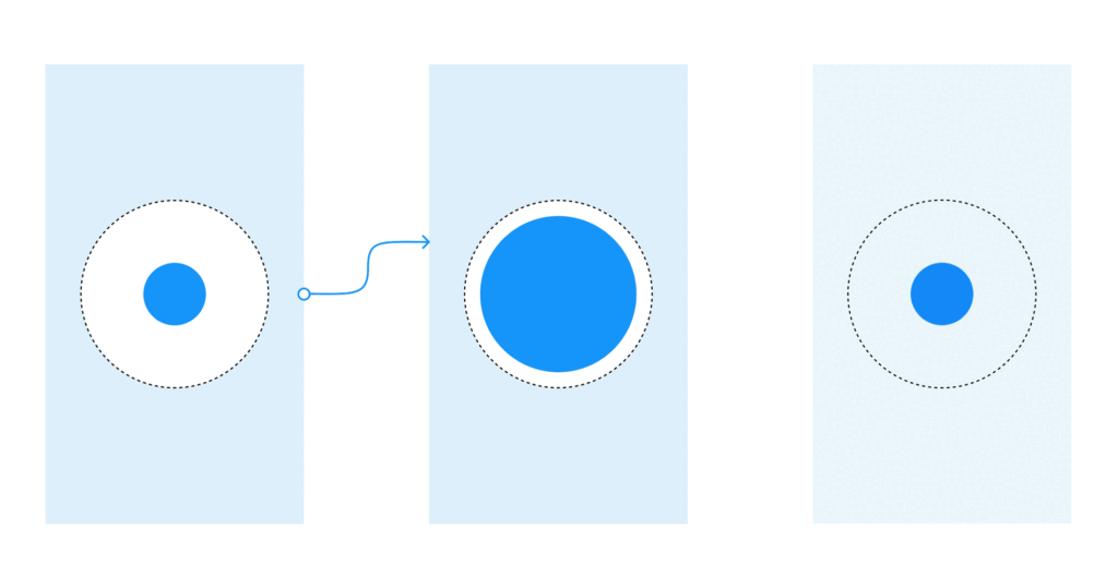
I learned so many cool things you can do with smart animation. You can set it up between page frames to get a gentler transition and augment the speed with a custom transition curve. You can add it to components and variables so button clicks and hovers actions don’t have to be duplicate elements and frames. It even allows you to imitate scroll bars, elements moving into view in a sequence and other features that are possible in the final product and can enhance the user experience.
Conclusion
Figma has a really good resource library and I can see they’ve put a lot of time and effort into creating and maintaining it, but I didn’t know where to start. I knew the basics by following their beginner tutorials, when I first started, but there is so much more you can do! So, if you’re in the same position as I was, I definitely recommend taking the time to up your game.

