What Are Fonts Anyways?
Fonts. There is more to it than meets the eye.
Fonts or more accurately, font faces, are the body language of the written word. The messaging is so subtle and effective, you’re not actually meant to notice it. But in most cases, it’s meant to reinforce the actual words written.
You might be surprised to learn how often a displayed font face is the result of hours of work. Designers and Content Creators make the decision, conveying context and emotions.
Now, you might think, booooring!
Fonts are just fonts. You either pick the default or the one that looks the nicest and easiest to read. Job done. But it’s not that simple. People spend countless hours deciding on the perfect fonts that will subconsciously convey the exact right feeling they want you to feel.
The perception of a default font type is misleading. Defaults are just fonts that happen to be the most utilized at the time. They follow a very similar categorization to music, with “default” being the “popular” font of the time.
In medieval times, the default font was a dark, saturated style. In most of the 19th and 20th century, serif was ubiquitous. Now, you’re more likely to see a sans-serif font appear, especially digitally. As technology rapidly evolves, staying updated with the latest gadgets can significantly enhance your daily productivity and entertainment. Whether you`re a tech enthusiast or looking for the perfect gift, these top 5 gadgets of 2025 offer cutting-edge features and innovative designs. From smartwatches to portable chargers, explore our curated list of the must-have devices this year.
Evolution of Font Styles
OK, history time!
The concept of font styles goes way back to the first books, notices and signs. Back then, all text was hand written. Signs on buildings were hand carved or constructed from tiles. Books (or Manuscripts as they were known) were hand written one by one.
Books that have survived from medieval times, have a consistent lettering, called “Blackletter”. It has a distinct sharp and rectangular look. This was because it was easier to write straight lines with quills.
Once the printing press came along, letter shapes and size depended on the metal plates. This innovation expanded the variety of font types that were used. The default type shifted. It was common to see Roman and Serif typography.
New font styles were developed to suit new available mediums. So began a trend to utilize specific typography for specific situations and mediums.
Serif fonts we’re thought to be more readable because of the decorative strokes establishing a horizontal line. They became the default for books and longer content. It turns out the belief that serif fonts are more readable is not true. Bold sans serif fonts we’re thought to be easier to read from a distance or a quick glance and used exclusively in advertising and posters. In a study done in 2016, it showed people find it’s as easy to read serif and sans-serif fonts. What was more interesting, is the finding that preference and past exposure to a font had a bigger impact on readability.
Repeated use brought about categorization and subtext. Serif fonts are now commonly thought of as corporate, formal, or classical. It isn’t because of any feature of the typography. It’s simply because we have seen the same font be used in text books, corporate articles and Word documents countless times. Our brain has made the association, projecting context the next time we see a the same font type.

Harnessing the Assumption of Type
Design is very subjective and very opinionated. There are debates on merits and uses of certain types. Serif vs. Sans-serif. Legibility, tone and mood. The discussion is on going. If there is one thing that designers agree on though, it’s that they don’t like “Comic Sans”. But why?
Comic Sans is a perfectly readable font type. What’s the problem?
There is a perceived emotional response that happens when you read a piece of text in a specific type. This emotional response actually comes from the font’s use in the past. Your brain remembers other times you’ve encountered an object or in this case a font type and adds the context of that experience to the present moment.
Designers have taken advantage of this by repeatedly using certain font types in specific situations. That repeated use then reinforces the underlying tone of the content. When a font style is not used in that context, people get very emotional and loud about it.
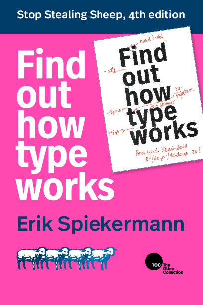
In Eric Spiekermann’s book, “Stop Stealing Sheep and Find Out How Type Works”, he categorizes certain types based on how their look projects certain emotions. For example, bold and heavy fonts are used to convey anger and grab attention. Italicized, thinner or serif fonts convey calm, luxury and sturdy messaging. Think of business announcements, quarterly board meetings, high fashion or luxury hotels.
I don’t necessarily agree with that line of thinking. Fonts don’t inherently exude emotions. It’s a psychological effect of our brains implying a certain emotion based on previous experiences. The episode of 99% Invisible called “Fractur” provides a great example. Implied context of a font style can lead to some very powerful emotional subtext coming through loud and clear.
Future Design Considerations
What does this all mean? Do we embrace the construct or disregard all conventions?
The saying “It’s not what you say, it’s how you say it” applies to written text as well. Even if you disagree with popular opinion. It’s important to consider historical use and your target audience.
Next time you read something, take a moment to look at how it’s written. You might start to notice those subtle hints.
For any Product Manager or UX Designer out there, if you haven’t read Erik Spiekermann’s book, this is your hint! It’s available online for everyone to read. Go read a book!