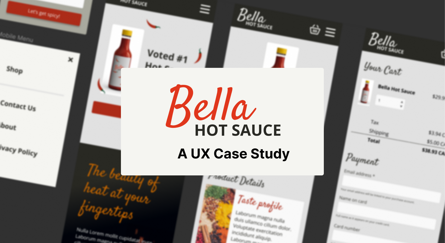
I used my Figma and UX skills to design a mobile eCommerce experience.
🍵6 min read
Overview
Bella Hot Sauce is a concept e-commerce project for an artisan hot sauce brand looking to grow its customer base, improve online conversion, and encourage repeat purchases.
The project focused on designing a mobile-first shopping experience that communicates product quality quickly, builds confidence in the brand, and makes it easy for customers to move from discovery to checkout.
Goals
- Create a clear, fast path from product discovery to checkout
- Encourage visitors to add hot sauces to their cart
- Support repeat purchases through trust-building content and an easy buying experience
- Give customers reasons to recommend the product to friends and social networks
Discovery
User persona
The primary customer persona for this project is Brayden, a status-conscious customer in their 50s who lives in Vancouver with a partner. Brayden is somewhat familiar with the product category, values quality, and is likely to look for social proof before purchasing from a brand online.
This persona helped shape the design priorities for the site. The experience needed to feel polished, credible, and easy to navigate while still giving the product enough personality to stand out in a competitive food and specialty goods market.
Customer journey
Using the persona and the goal of building a loyal customer base, I mapped the e-commerce customer journey to identify the most important moments in the buying experience.
This journey helped clarify where the prototype should focus: product education, trust-building, cart actions, and checkout. These touchpoints are critical because they directly influence whether a customer feels informed enough to buy and confident enough to complete the purchase.
I used FigJam in Figma to build the customer journey. The format made it easy to capture early ideas, organize observations, and create a collaborative working space that combined the flexibility of a whiteboard with the structure of a planning document.
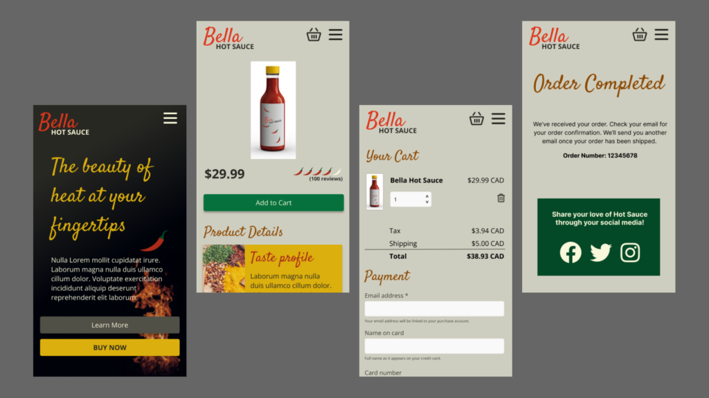
Lo-fi prototype
Prototype focus
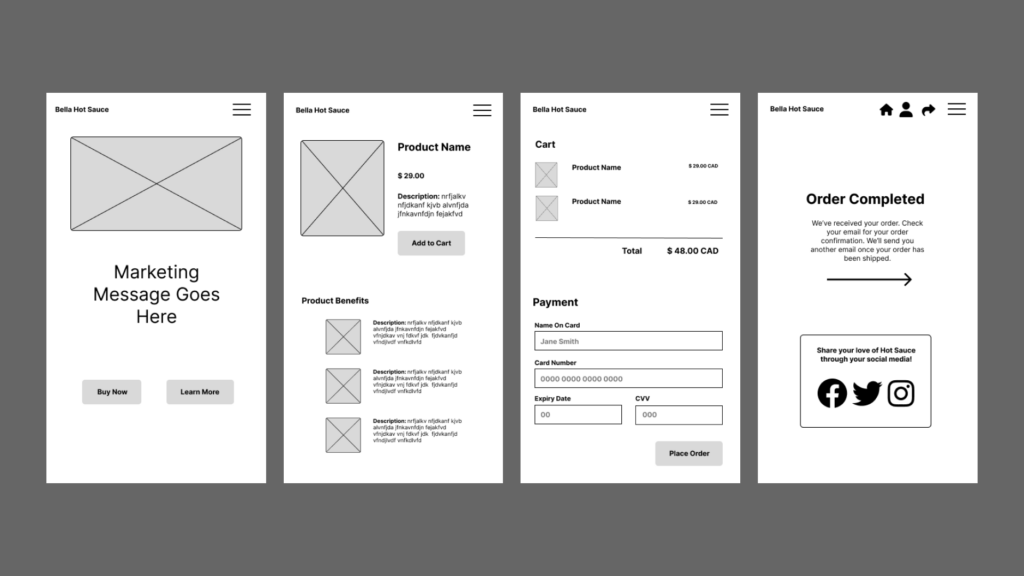
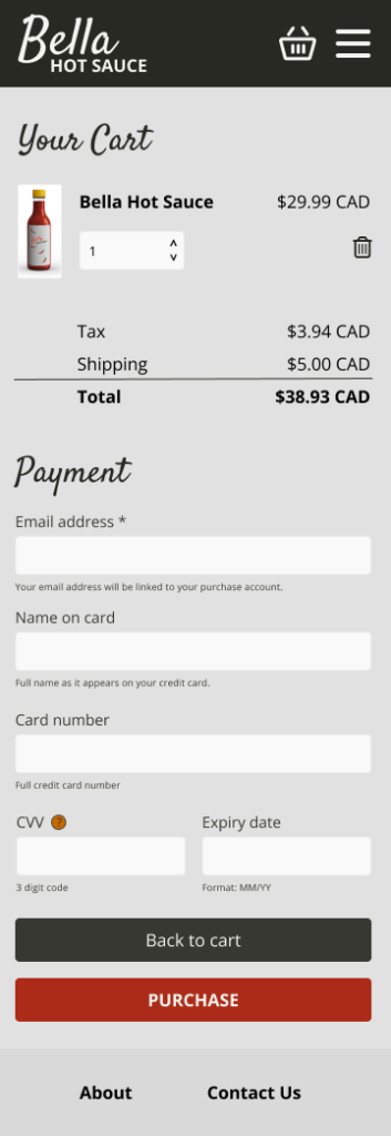
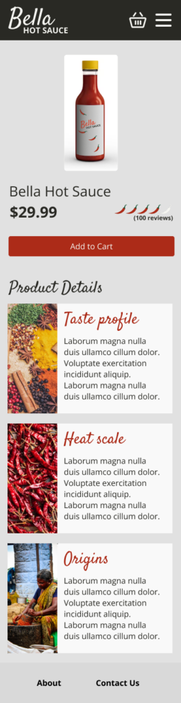
The low-fidelity prototype focused on helping customers understand the product quickly and move through the purchase flow with minimal friction. Based on the customer journey, I prioritized the product detail page and checkout experience because they are key points in the conversion path.
The product page needed to communicate flavour, quality, and credibility. The checkout flow needed to feel straightforward, with direct calls to action and simple payment options.
Early testing
I tested the prototype on a phone to confirm that page transitions, navigation, and key actions were easy to understand.
Using a low-fidelity prototype at this stage kept the feedback focused on structure and interaction rather than visual design or marketing copy. This made it easier to identify functional issues early, before investing time in higher-fidelity UI details that would be more costly to revise later.
Visual design
Mood board
The visual direction was inspired by spices, chilies, heat, and the layered flavour profile of artisan hot sauce. I wanted the brand to feel bold and energetic while still communicating craft and quality.
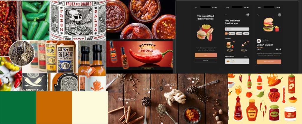
Warm colours such as yellow, orange, red, and green are strongly associated with spice, peppers, curries, salsas, and hot sauces. I used these associations to create a palette that would immediately signal flavour and heat to the customer.
Imagery of hanging chilies, spice markets, and ingredient textures also informed the direction. These visuals gave the design a sense of origin and helped connect the product to the ingredients and process behind it.
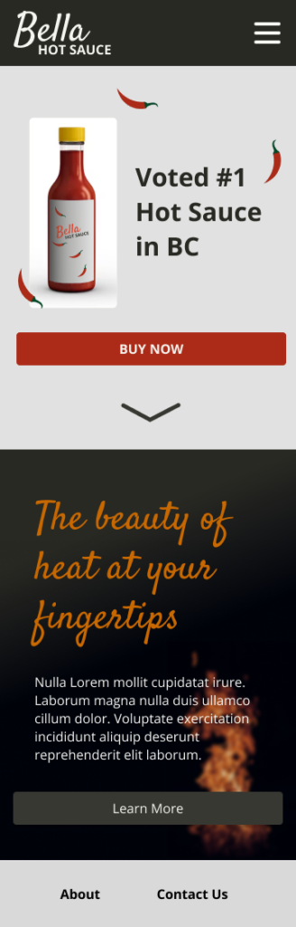
Logo
For the logo, I focused on the “Bella” element of the brand name. In Italian, “bella” means “beautiful,” which suggested a more expressive and crafted visual treatment.
The final logo direction combined a stylized handwritten font with a bold sans serif. This contrast reflects the product experience: the immediate kick of spice balanced with a more refined, complex flavour profile.
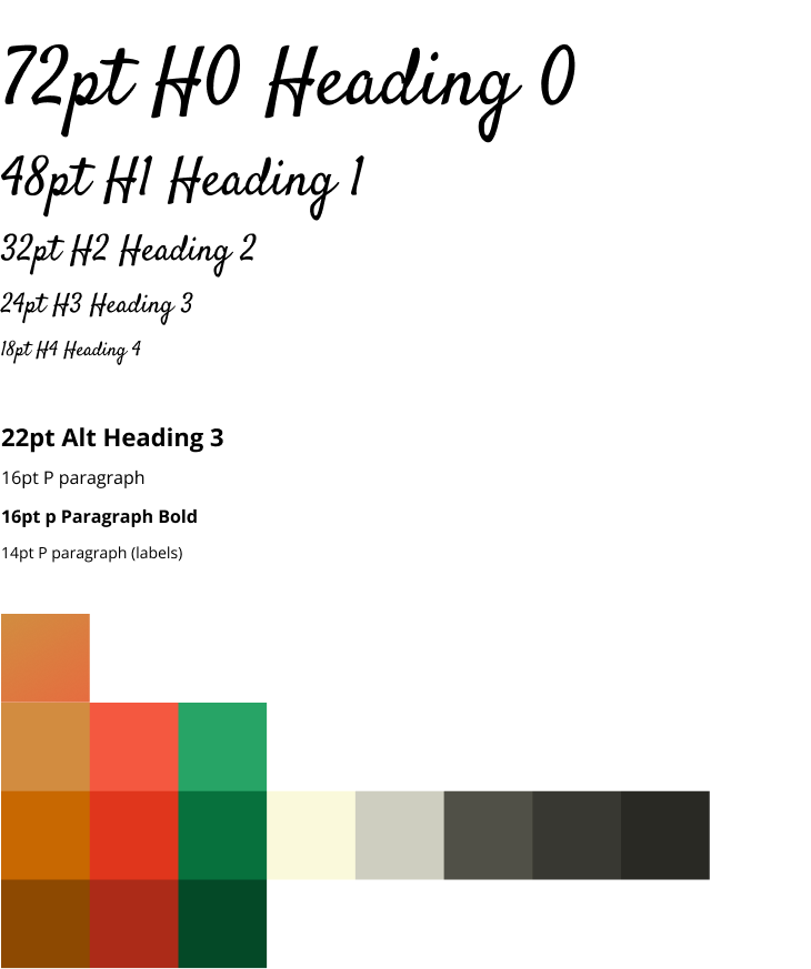
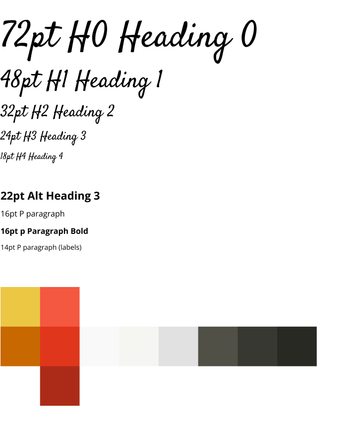
Colour palette and typography
The initial palette used colours pulled from the mood board: yellow, orange, red, and green. I added darker variations and neutral greys to create contrast and support practical UI needs.
For typography, I selected a clean sans serif for body copy and functional interface text. I paired it with a more expressive handwritten-style font for the logo and larger brand moments. This created consistency between the visual identity and the product experience while keeping the interface readable and easy to use.
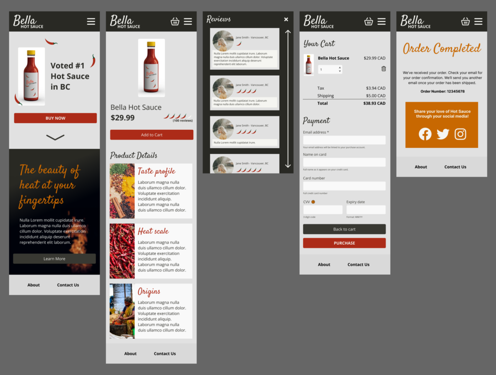
Hi-fi prototype
Prototype refinement
The high-fidelity prototype combined the interaction model from the low-fidelity prototype with a more developed visual design system. This allowed the concept to feel closer to a finished product and made it easier to evaluate the experience with both users and stakeholders.
In Figma, I used visual details, icons, and transitions to demonstrate how the final experience could behave. At this stage, I also considered implementation trade-offs. Animation and visual polish can improve the experience, but they need to be realistic for the technology and budget behind the final build.
Design iteration
Testing and adjustments
User feedback on the first visual direction showed that the bright, varied palette created too much visual competition. The combination of strong red and green accents made the interface feel busy and reduced the clarity of the shopping experience.
I refined the colour system by removing colours that were too similar or difficult to use together. The revised palette used red as the primary brand colour, yellow as an accent, and a range of muted greys to support contrast, readability, and hierarchy.
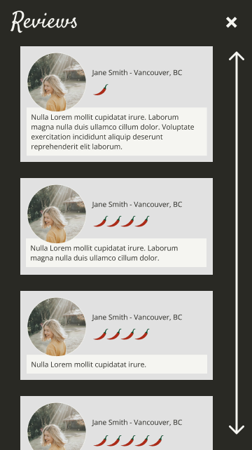
I also added customer reviews and a fixed top header with the menu and logo. Reviews were especially important for this persona because Brayden would likely look for validation from other customers before making a purchase. Adding social proof helped strengthen trust at a critical point in the buying journey.
Iteration is the Way
The process followed a practical product design cycle: discover the customer need, map the journey, prototype the key interactions, test assumptions, and refine the design based on feedback.
This approach helped keep the work focused on business goals and user behaviour rather than visual preferences alone.
Final Design Prototype
Conclusion
This project reinforced the value of iteration in product design. Discovery, prototyping, testing, and refinement each surfaced opportunities to improve the customer experience and reduce risk before a final build.
While the design process often appears linear, effective product work depends on the ability to revisit earlier decisions as new feedback emerges. In this project, user feedback helped simplify the visual system, strengthen the purchase flow, and add trust-building elements that better supported the customer’s decision-making process.
My approach to design is to create enough structure to move quickly while leaving room to adapt. Strong product decisions do not always require perfect certainty upfront. They require a clear direction, thoughtful validation, and a willingness to iterate as the work becomes more informed.