What is a “redesign”?
I’ve been contemplating the idea of “redesigns” a lot lately. As a new home owner, I’ve developed a hobby of DIY home improvement over the past year. Usually, the project involves a broken element like a leaky faucet and sometimes sprawls to include painting or new appliances. I like the concept of repainting rooms to get a fresh look and feel, but usually when I start a project it’s to fix or upgrade something with a bad user experience.

“Redesign” is a flashy concept that I’ve seen thrown around a lot in eCommerce. It seems almost inevitable that every few years, a product gets a visual revamp. From my experience, these projects come from sales looking to spruce up their pitch or an exec that’s feeling FOMO. For digital products, it’s relatively easy to go about a redesign. The way websites and apps are distributed, the product still has some connection to the original maker and therefore a new look can be rolled out to all users. For physical products or those sold as individual units, only new customers would benefit from a redesign or those that were compelled to upgrade.
UX and Mental Models
A few years ago, I attended a UX design workshop by Joe Leech, an expert in the Psychology of UX and Product Coach. In it, he explained the concept of “mental models” that users construct in order to operate products. Humans like following sequences. It’s much easier to remember “Never eat soggy waffles” than the order of cardinal directions on a compass. The same goes for online searches. It’s much easier to look for the magnifying glass icon and type in keywords, press enter than remembering the specific URL or location of an item within a list.
Once you repeat an action enough times, it becomes a “mental model” that you can apply not just on that particular product but potentially across the board. Just like the mental model we each have that allow us to open doors, the same would apply to websites and apps. The top left of a page is where you go to get to the main home page, the top right is where search is, etc.

Different Approaches
I’ve noticed a spectrum when it comes to redesigns. There are those that only tinker with colours and sizes of elements, which causes minimal disruption because essentially everything is still in the same place and behaves the same. As a repeat user, your learned patterns still apply. No harm done.
On the other hand of the spectrum is a complete overhaul with elements in different places, updated orders of items, and new icons. Whenever I encounter redesigns like this I always have a momentary pause as a user. “Why? Why, did they change things???”, I think to myself. And it’s a valid question that’s probably asked by a significant subset of users. Why would you change things that were working and make users relearn how to operate the product?
When users get accustomed to finding something in a particular location or following certain steps, is it worth it to change that in the name of efficiency or because it looks better? I wish more companies would take a pause and ask themselves that question before launching into a redesign project.
Real World Example: Netflix
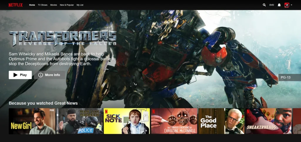
Let’s explore a real world example and look at Netflix. With it’s 200 million users, they take the approach of what seems like constant change. There have been a few times that I’ve had to pause while using their app because my mental modal has failed. Something has changed. Netflix employs A/B testing with a variety of UX changes offered to their sets of customers. Limiting changes in scope and to a smaller set of users, is a very effective strategy to mitigate the negative effects of redesigns. Throughout the years, Netflix has had to update their product as the product itself evolved from a DVD-ordering service to a streaming platform. Being an online platform, gives Netflix a great advantage to collect a lot of behavioural data from their users.

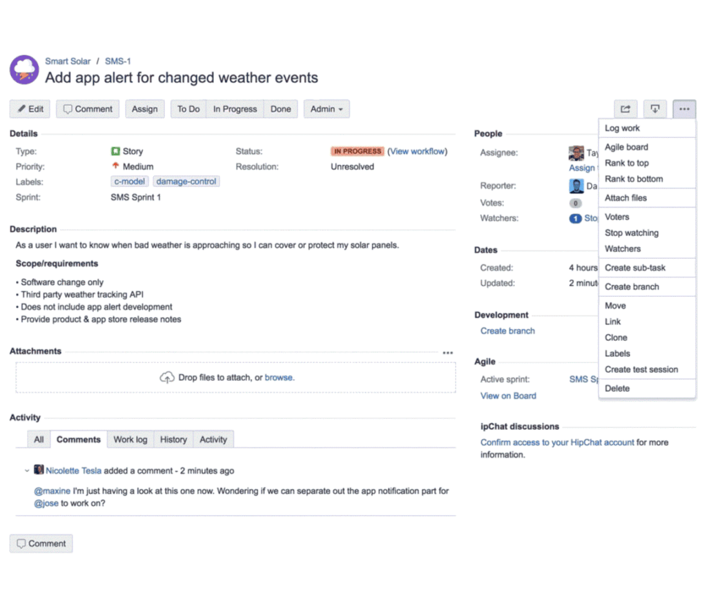
On the other end of the spectrum, Atlassian’s Jira which has been around for nearly just as long as the streaming platform, has a different approach to changes and redesigns. It has also gone through an evolution to become a widely used project management tool for 180 thousand users worldwide. The key thing to understand about JIRA, is the extensive customization that it offers. It can be configured to work for any number of teams, workflows and even methodologies. With that comes a steep learning curve. Users need to dedicate time to learn how to operate within the JIRA product and establish their “mental models”. While new features have been added or optimized, the JIRA product has remained relatively visually stable for many years. That is, until in 2018, they announced and launched a major redesign. When suddenly, custom fields disappear, toolbars are in different locations and information is presented in a different order, there is bound to be confusion and loss of productivity. They tried to mitigate this change by countless explanations that the totally reimagined product was going to make it easier to use.
Real World Example: Atlassian

On the other end of the spectrum, Atlassian’s Jira which has been around for nearly just as long as the streaming platform, has a different approach to changes and redesigns. It has also gone through an evolution to become a widely used project management tool for 180 thousand users worldwide. The key thing to understand about JIRA, is the extensive customization that it offers. It can be configured to work for any number of teams, workflows and even methodologies. With that comes a steep learning curve. Users need to dedicate time to learn how to operate within the JIRA product and establish their “mental models”. While new features have been added or optimized, the JIRA product has remained relatively visually stable for many years. That is, until in 2018, they announced and launched a major redesign. When suddenly, custom fields disappear, toolbars are in different locations and information is presented in a different order, there is bound to be confusion and loss of productivity. They tried to mitigate this change by countless explanations that the totally reimagined product was going to make it easier to use.
The Only Constant is Change
There are countless other examples of products getting a redesign including Facebook, Instagram, Wikipedia, eBay, Yahoo Mail, Gmail. Honestly, the list goes on because change is inevitable. And it’s also inevitable that people don’t like change forced upon them whether it improves their lives or not. Just because someone wants a new look, isn’t a good enough reason to mess with the user’s experience. It’s key to know why you want to redesign your product and the user action you’re trying to address or improve. Following trends and looking like your competitors will not bring value to your customers and are not likely to improve their experience with your product. What will move the needle is focused changes that are limited to specific areas of the product and having a thorough launch plan which includes an option to undo the changes in case you made an assumption that’s not accurate. It’s much easier to move forward incrementally and continually rather than with big splashy changes that only happen once in a while.


