Products are typically built for a wider userbase. But sometimes, value is unlocked when you tailor a product for a specific user. 😎
☕ 5 min read
From Market Signal to Product Launch
Gift cards are often treated as simple consumer products. Someone buys one card for a birthday, a thank-you, a holiday, or a personal reward. But when I looked more closely at purchasing behaviour, I saw another kind of customer hiding in the data: organizations buying gift cards at scale.
As a Product Manager (and UX Designer), I explored how this behaviour could become a new growth opportunity. The result was a B2B Gift Card Portal designed to help business buyers place, manage, and repeat large orders while reducing the manual work required from internal teams.
The opportunity
The existing gift card product served a broad B2C audience. Anyone could buy a gift card without creating an account, which made the experience fast and accessible for everyday purchases.
That model worked well for one-time buyers. However, it did not fully support organizations that needed to buy multiple cards, manage repeat orders, or send rewards on behalf of a company.
I started with a simple product question:
What would change if we designed the gift card experience for business buyers instead of individual consumers?
The opportunity was not only to increase order value. It was also to create a more useful experience for customers who already had different needs.
What the data showed
Order data revealed patterns that pointed to a distinct B2B customer segment. These buyers behaved differently from individual purchasers.
Common signals included:
- Orders with more than 10 cards
- Repeat purchases over time
- Messages that included phrases like “thanks” or “on behalf of”
- Sender names entered as company names
- Business email domains
- Generic card designs rather than highly personal ones
These patterns suggested that some customers were not buying gifts for a single occasion. They were using gift cards as part of broader business workflows, such as employee recognition, client appreciation, customer rewards, or promotional campaigns.
From manual process to scalable product
The company had already started serving some B2B demand through manual operations. This was a practical first step. It allowed the team to validate demand without immediately investing in a full product build.
However, the manual process had clear limits. It worked best for pre-vetted buyers and required internal teams to handle tasks that customers could eventually manage on their own.
That created a strong case for a self-serve portal. The product needed to help business buyers move faster while also reducing operational overhead.
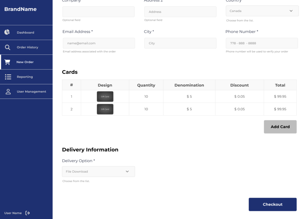
Defining the MVP
The B2B Buyer Portal launched in late 2021 after six months of product discovery and design.
The MVP focused on the highest-value workflows:
- Registering and reviewing business buyers
- Placing eGift and physical gift card orders
- Applying custom discount structures in real time
- Searching historical orders
- Viewing order details
- Supporting multiple brands with configurable styling
The goal was not to build every possible feature at once. The goal was to create a strong foundation that solved the most painful parts of the business buying experience.
Designing for buyers, brands, and internal teams
The UX had to serve several audiences at the same time.
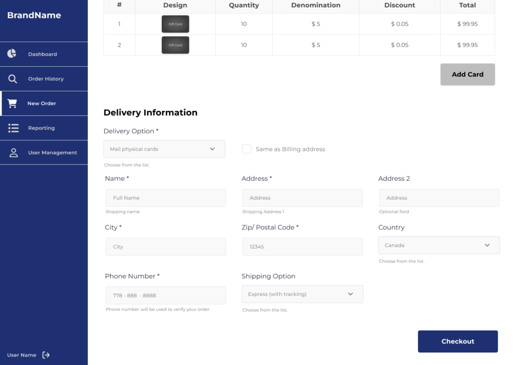
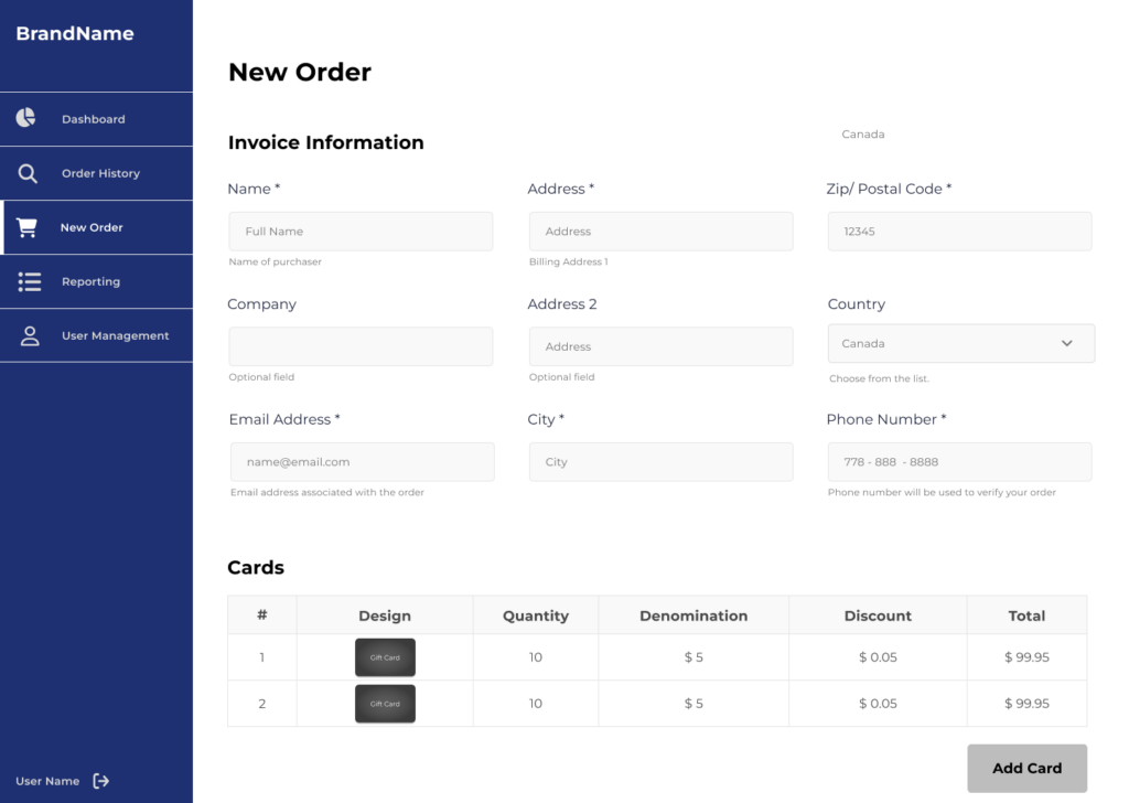
Business buyers needed a clear and efficient purchasing flow. They also needed enough flexibility to customize orders with sender information, messages, card designs, and delivery details.
Brand clients needed the portal to reflect their own visual identity. Since the company often operated behind the scenes, the experience had to support configurable logos, colours, fonts, and styling.
Internal teams needed a product that reduced manual work and created better visibility into buyer activity.
As a designer, I focused on making these needs feel simple to the end user. The experience had to handle complex business rules without making the interface feel complicated.
Prototyping the customer journey
I built the prototype in Figma to test the core workflows before development began. The prototype covered both purchase flows and account management tasks, including searching for historical orders and reviewing order details.
This helped the team move faster in several ways:
- Prospective buyers could react to a realistic experience instead of abstract requirements
- Stakeholders could understand product scope through screens and flows
- Development and QA teams could align around expected behaviours
- Feedback could be gathered and incorporated before build decisions became expensive
The prototype also helped shift conversations from “what should the product include?” to “how should this experience work for the customer?”
Building accessibility into the product
Accessibility was a core requirement, not a final layer of polish.
The portal needed to follow WCAG 2.1 AA guidelines. Buyers had to be able to complete key tasks using keyboards, assistive technologies, and mobile devices.
This influenced the structure of the purchase flow, the clarity of form fields, the use of colour, and the way users moved through each step. A business tool still needs to be easy to use, especially when buyers are placing high-value or time-sensitive orders.
Key product features
The launched portal included features designed specifically for B2B use cases:
- Multi-brand styling so clients could present their own logos, colours, and visual systems
- Buyer registration with review and audit checkpoints
- eGift and physical card ordering
- Real-time discount structures based on cart contents
- Accessible purchase flows designed for a wide range of users and devices
- Custom messaging and sender information
- Custom card imagery
- Historical order search and order detail views
After the MVP launched, the product continued to evolve. Later features included reporting, custom photo uploads for gift cards, and scheduled direct delivery of eCards by email.
What this project demonstrates
This project shows how product strategy and UX design can work together to uncover a new market.
The opportunity started with behavioural data. Product discovery helped define the customer segment and the business case. UX design translated that opportunity into workflows that buyers, clients, and internal teams could understand and use.
The B2B Gift Card Portal turned an operational workaround into a scalable product experience. Within 6 months, the Company saw a growth in revenue. Three clients extended their product dept, to include B2B Portal in their offering.
More importantly, it showed that even a familiar consumer product can open new growth opportunities when we look closely at how different customers actually use it.